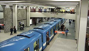
ARCHITECTURAL OVERVIEW
Each metro station in Montreal is completely unique. Here's a quick overview of each of our stations, to help first-time visitors choose some to learn about according to their interest.
Green Line
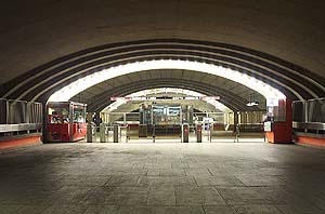
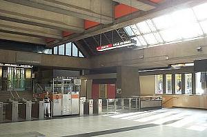
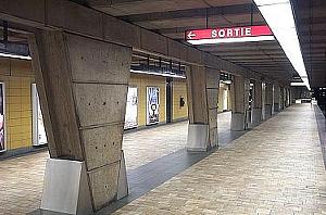
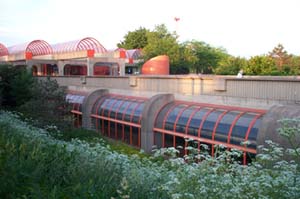 Angrignon
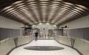
This station's curved windows dazzle the platform level with natural light. An array of domed marquises links the station to its bus terminal. Matt's Rating: 
| 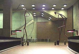 Monk
MonkMuted colours enhance the curves of the huge, stunning volume and its monumental statues. Matt's Rating:
|  Jolicoeur
An austere dark exterior gives way to brilliant natural illumination and attractively decorated platforms. Matt's Rating:
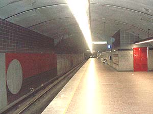
|  Verdun
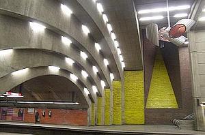
Brightly-coloured decoration and a natural light shaft lessen the impact of the large cut-and-cover volume. Matt's Rating:
|  De l'Église
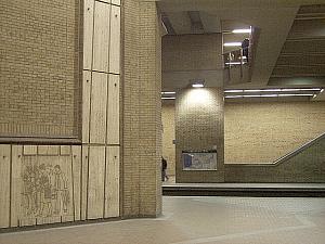
Weak surrounding rock made a difficult and tortuous plan necessary. This hurts the station's ease of use and aesthetics, despite a unifying decorative motif and attractive kiosks. Matt's Rating:
|  LaSalle
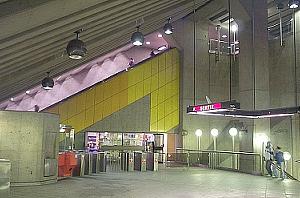
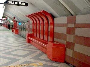
The entire station practically constitutes a work of abstract sculpture in itself, with its astonishing brightly-coloured forms and angular spaces. Matt's Rating:
|
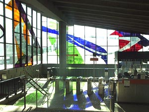
 Charlevoix
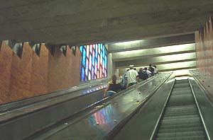
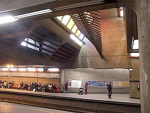
This station's extreme depth is softened by low-ceilinged staircases and bright natural light delivered through flamboyant stained-glass windows. The unusual track layout is extenuated by a simple traffic flow. Matt's Rating:
|
 Lionel-Groulx
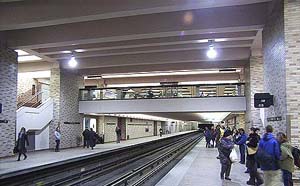
The best-designed transfer station allows simple transfers across its central platforms for the majority of travellers. Bright colours on the floor and a beautiful wooden sculpture contrast with the air of efficiency in its lines and exposed concrete. Matt's Rating:
|
 Atwater
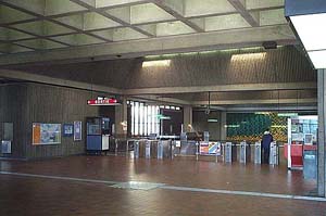
A strictly utilitarian station in beige and brown, serving as the central point for a western portion of the Underground City. Matt's Rating:
|
 Guy-Concordia
Ugly brown decoration was removed, at least in part of the station, and replaced with multicoloured mosaics and difficult-to-clean white walls; not helped by a lack of artwork. Matt's Rating:
|
 Peel
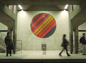
PeelA constant theme of circles provides design unity with Jean-Paul Mousseau's historically significant tiled circle artworks. The mezzanine level is borne aloft on pillars within the cut-and-cover volume. Matt's Rating:
|
 McGill
A handsome colour scheme and a number of interesting artworks, including a large series in stained glass on the history of Montreal, mark the city's busiest station and an essential link in the Underground City. Matt's Rating:
|
 Place-des-Arts
Stylish zig-zag architecture and a light blue colour scheme provide a cultured feeling appropriate to the setting. To note: a stained-glass mural on the history of music in Montreal, the first artwork to be installed in the metro. Matt's Rating:
|
 Saint-Laurent
A plain station whose only decoration is panels of coloured tiles in the large volume. Matt's Rating:
|
 Berri-UQAM
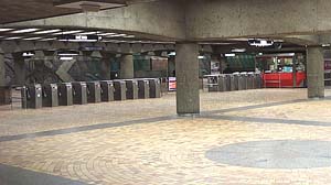
The largest station in the network, where three lines meet, contains a number of works of art, but they are not enhanced by a comparatively plain and sometimes poorly-maintained setting. Matt's Rating:
|
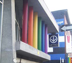 Beaudry
Despite the dull tiling scheme at platform level, this station is famous for its moving sidewalk and its beautiful new kiosk bearing the colours of the rainbow flag, in honour of the gay and lesbian Village where it is located. Matt's Rating:
|
 Papineau
A strange, passé colour scheme is partially made up for by a trio of interesting murals on the 1837 Patriotes rebellion and by the attractive new kiosk. Matt's Rating:
|
 Frontenac
The new, modern kiosk can't save the extreme, uninspired dullness of the rest of the station. Matt's Rating:
|
 Préfontaine
A generous provision for natural light, as well as a number of decorating accents such as rainbow panels, repeated use of the metro logo, and innovative light fixtures, beautify the inner space in this station. Matt's Rating:
|
 Joliette
Vintage '60s horror, from the lemon-yellow walls to the tacky sculpture in the mezzanine. Matt's Rating:
|
 Pie-IX
Muted earth tones give a calm power to this station's vast spaces. The artwork is Olympic-themed, including the beautiful work Citius, Altius, Fortius by Jordi Bonet. Matt's Rating:
|
 Viau
ViauA soberly-decorated station, with a mural representing the Olympic Stadium in a central position in the large kiosk. Matt's Rating:
|
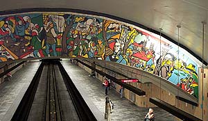
 Assomption
The station's main volume is made stunning by its oblique angles. Murals by Guy Montpetit. Matt's Rating:
|
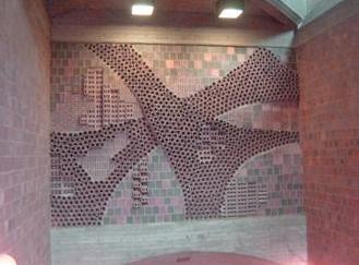
 Cadillac
One of four consecutive stations that show the 1970s emphasis on bare concrete; a symmetrical, spare station, with two complementary murals as accents of colour. Matt's Rating:
|
 Langelier
All-concrete construction again: essentially one huge vault, with acute angles in the overhanging mezzanine and walls covered in prefabricated bracket-shaped seating units. Matt's Rating:
|
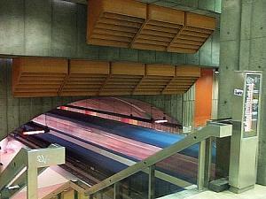
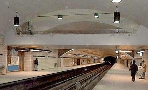
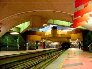
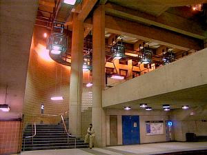
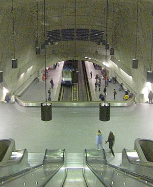 Radisson
1970s exposed concrete design at its best - dramatic, science-fictionesque rounded shapes with a central escalator column that soars unsupported through a high volume. Matt's Rating:
|
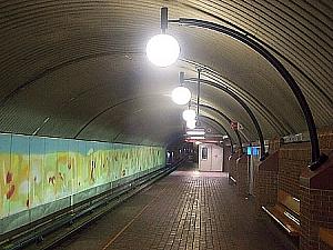
 Honoré-Beaugrand
A combination of efficient traffic flow and elegant design. The platform levels are decorated with a long poured-concrete frieze. Matt's Rating:
|
Orange Line
 Côte-Vertu
Semicircular forms that speed traffic flow dominate. The brick-clad space includes yellow accents and two large stainless-steel murals. Matt's Rating:
|
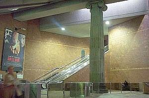 Du Collège
The theme is classical elegance, reflecting the educational institutions it serves; an Ionic column has pride of place, with a profusion of stained glass windows decorating the kiosks. Matt's Rating:
|
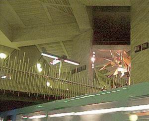 De la Savane
Fascinating all-concrete architecture with lots of jagged angles and scattered, semispherical light fixtures. A light-shaft and fixtures cast multicolored light on a spiky sculpture of a calcite crystal. Matt's Rating:
|
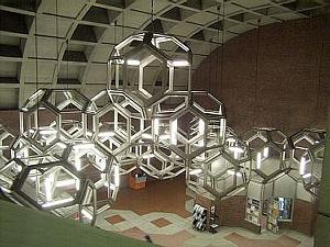 Namur
NamurThe station's decoration is quite plain, except for the astonishing, enormous illuminated molecular structure suspended in mid-air and spreading all through the great volume of the mezzanine. Matt's Rating:
|
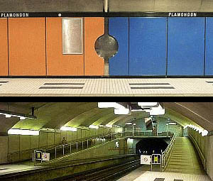 Plamondon
The polarized colour scheme - the north blue, the south red - plays on the entrances situated at either end of the station. The rest of the decoration makes good use of steel and backlit glass bricks. Matt's Rating:
|
 Côte-Sainte-Catherine
A sloping central volume that permits an overview of the whole station is brightened with bright yellow panels and abundant lighting. Matt's Rating:
|
Snowdon — click here to read architectural overview.
 Villa-Maria
Another station with a deep, tall volume in the access area. Circular murals and seating units in autumn colours. Matt's Rating:
|
 Vendôme
A sleek modern interior and curved metal exterior both reproduce the commuter trains it also serves. A sculpture and stained-glass window by Marcelle Ferron. Matt's Rating:
|
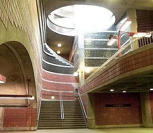
 Place-Saint-Henri
A beautiful modernist station. The deep internal volume, separated by dramatic curtain walls, is a succession of stacking vaults, with a mobile sculpture suspended in midair. Gradients of colour from either the ends to the escalator shaft meet in high triangular light shafts. Several artworks in the hexagon-themed mezzanine and kiosks. Matt's Rating:
|
Lionel-Groulx — click here to read architectural overview.
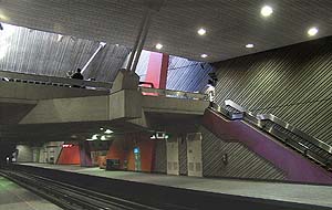
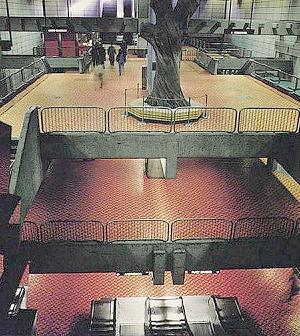
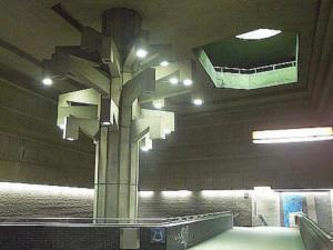 Georges-Vanier Georges-VanierA terribly smart dark grey and blue colour scheme in precise forms, and angular lines in the central volume and bridge surrounding a tall tree-shaped sculpture. A stylish post-modern achievement. Matt's Rating:
|
 Lucien-L'Allier
An immense, unadorned volume brings the height of one of the deepest stations in the network to bear with full force on the traveller. Matt's Rating:
|
 Bonaventure BonaventureOne of the most elegant stations of the first network, with warm brown brick cladding, striking pyramidal light fixtures, and bridges spanning the cut-and-cover volume below the mezzanine. Matt's Rating:
|
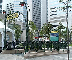 Square-Victoria
A variety of different cladding patterns combine in the purest example of the International style in the network, crowned by the Hector Guimard art nouveau Parisian metro entrance on the Saint-Antoine exit, the only authentic one in use outside Paris. Matt's Rating:
|
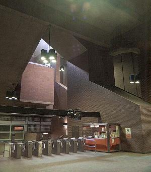
 Place-d'Armes Place-d'ArmesThere is little of interest in this station slung under the Palais des Congrès. Stainless steel cladding and displays from the Pointe-à-Callière Museum. Matt's Rating:
|
 Champ-de-Mars
The simple interior design is backdrop for Marcelle Ferron's stunning stained-glass window. This glorious work lets brilliantly coloured light splash into the mezzanine and platforms from three sides of the kiosk. One of the most beautiful works of art in the metro. Matt's Rating:
|
Berri-UQAM — click here to read architectural overview.
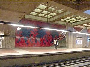
 Sherbrooke SherbrookeAn unornamented but attractive use of colours (beige, violet, and red-orange) in this station. Two unobstrusive works of art, plus a large colourful mosaic at platform level commemorating the achievements of the Saint-Jean-Baptiste Society. Matt's Rating:
|
 Mont-Royal
This station has a sober, clean, brooding, and contemporary feeling, but a redesign introduced certain rather severe practical problems. Matt's Rating:
|
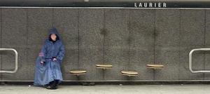 Laurier LaurierThe decoration of this tunnel-built station and of its rounded accessways and angular kiosks is unremarkable. Matt's Rating:
|
 Rosemont
The station is a bright, cheerful space with obliquely angled walls and pillars to distinguish it, and is a good representative of the architecture styles of the era of its construction. The dark, handsome kiosk is in a completely different style. Matt's Rating:
|
 Beaubien BeaubienThis station's unusual rounded forms - the cross-section of its platforms, the accesses, and the kiosk - today appear amusingly retro. Matt's Rating:
|
 Jean-Talon
An unspectacular but reasonable Sixties single-line station was adapted in the 1980s to create a transfer station with the blue line, with a huge and rather confusing set of galleries featuring striking overlooks and a huge, multistory mural. Matt's Rating:
|
 Jarry JarryThis plain station is mainly known for its vault of lozenge-shaped caissons over the connecting bridge. Matt's Rating:
|
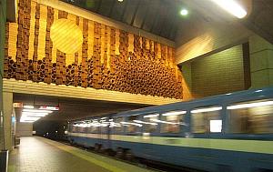
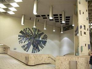 Crémazie
The attractive Sixties architecture includes a pair of split pillars joined by geometric shapes, as well as a huge circular mural commemorating three important Québécois poets. Matt's Rating:
|
 Sauvé SauvéIll thought out architecture (extremely narrow corridors) is worsened by bad decoration. Matt's Rating:
|
 Henri-Bourassa
The overall design of this sprawling station is nothing special, but it contains several beautiful and impressive sculptural murals. Note the new platform added for the Laval extension. Matt's Rating:
|
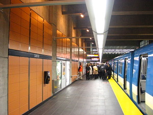 Cartier CartierSimplicity and wide spaces at platform level unite with intriguing shapes and skillful landscaping at the upper level. Materials are left to their natural colours. Matt's Rating:
|
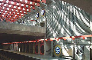
 De la Concorde
Based around three simple geometrical volumes, this beautiful, ultramodern building is both soothing and exciting. Bare concrete is used to full effect in the main volume, while the platforms are attractively decorated, and the design of the entrance building is highly innovative.
Matt's Rating:
|
 Montmorency MontmorencyThe great depth of the main volume is emphasized with exposed arches and beams. The platform decoration recalls artistic trends of the 60s and 70s, while the effect of the station's huge size is softened by playful suspended sculptures. Matt's Rating:
| | | |
Yellow Line
Berri-UQAM — click here to read architectural overview.
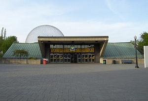 Jean-Drapeau Jean-DrapeauThe funnel-like forms of the vast kiosk and the broad waiting areas at platform level, not to mention its period styling, reveal its original vocation as the station that served Expo '67. Matt's Rating:
|
 Longueuil–Université-de-Sherbrooke
An unattractive, slapdash station slung under a shopping mall. Ill-favoured by interior design. Matt's Rating:
| |
Blue Line
 Snowdon SnowdonThis station composed of three parallel tunnels is attractively designed. However, it is hampered by the unfortunate arrangement of the lines, which renders the majority of transfers difficult, and by the degradation of its beautiful platform-length murals. Matt's Rating:
|
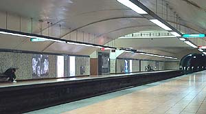
 Côte-des-Neiges
Most of this station is fairly unremarkable, but it does have intriguing works of art, including two cybernetic stained-glass windows and a set of sculptures. Matt's Rating:
|
 Université-de-Montréal Université-de-MontréalAn elegant, soberly-decorated station sunk into the natural slope of the mountain, with attractive interior layout and two well-integrated murals by the architect. Matt's Rating:
|
 Édouard-Montpetit
A surreal environment of curves and odd angles, all in shades of rose, including of course the famous shocking-pink benches. Quite unforgettable. Matt's Rating:
|
 Outremont OutremontClassic, formal architecture centred around a huge light shaft, with clean lines and elegant detailing. Matt's Rating:
|
 Acadie
A splendid, must-see station, filled with bold decoration and design, sharp angles, and intense colours. Even the furniture is art. Marvellous. Matt's Rating:
|
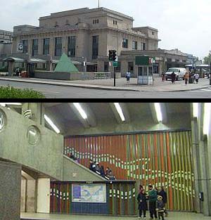 Parc ParcThis eclectic station crowns a completely modern underground portion with a beautiful old 1920s train terminal. Matt's Rating:
|
 De Castelnau
The design is all lightness and space, the materials pay homage to Italy and the Italian community, and whimsical wall carvings represent nearby Jean-Talon market. A lovely and graceful building. Matt's Rating:
|
Jean-Talon — click here to read architectural overview.
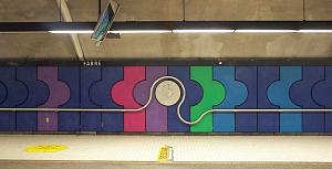 Fabre FabreA flamboyant use of brilliant colours, including a mural and functional sculpture that stretch from one end of the station to the other. Matt's Rating:
|
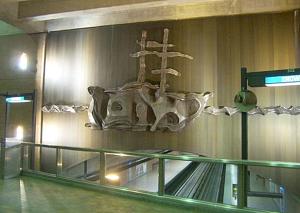 D'Iberville
A nondescript station in brown brick. One mezzanine is adorned with a large mural sculpture of Pierre Le Moyne D'Iberville's ship. Matt's Rating:
|
 Saint-Michel Saint-MichelExciting decorative architecture, with unusual shapes and fixtures. The platform is brightened by four brightly-coloured abstract murals enclosed in glass bricks. Matt's Rating:
| |
|